The Screen You’re Not Testing
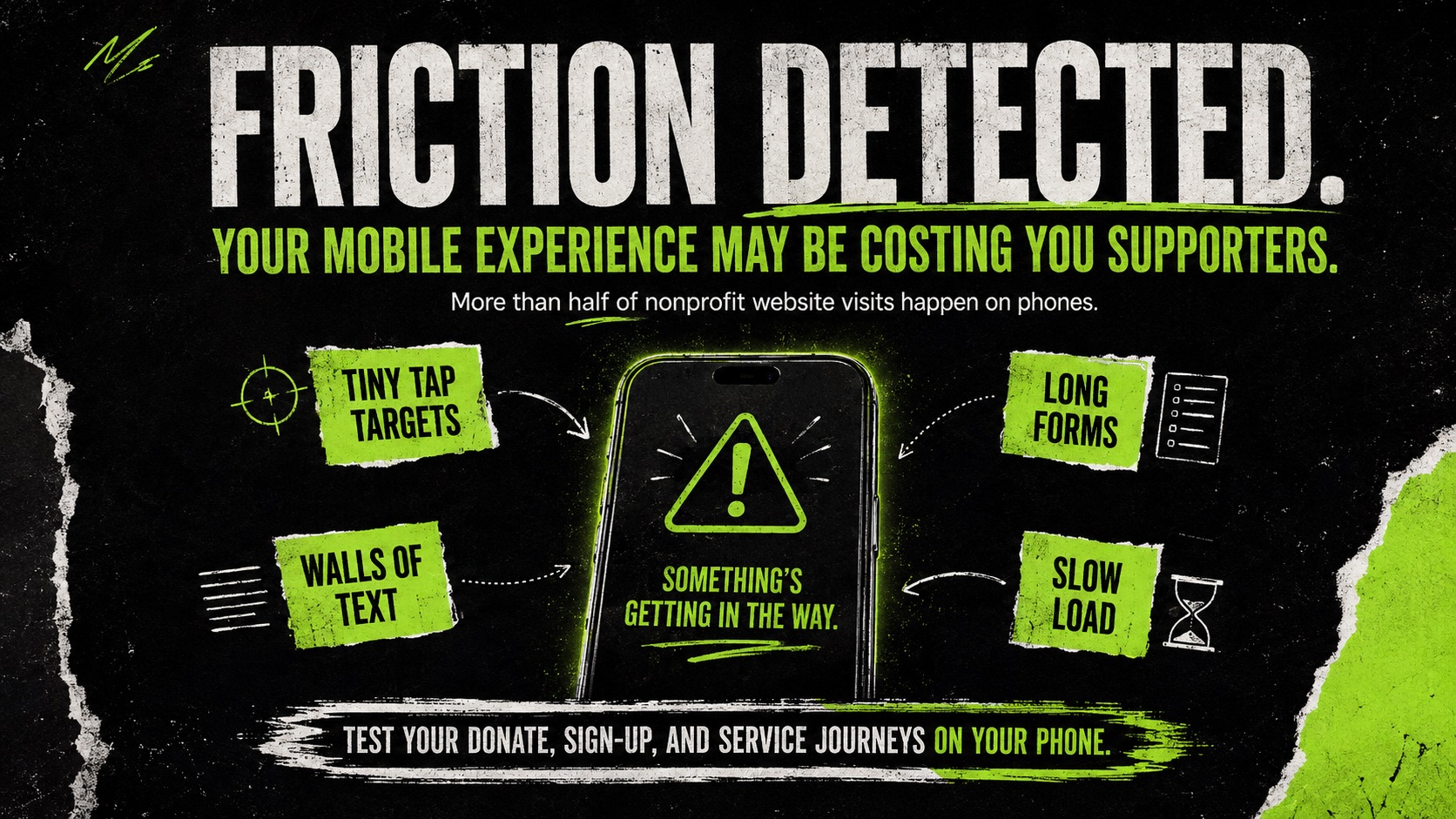
Your Nonprofit Website Is Probably Being Reviewed on the Wrong Screen
Most website reviews happen under pretty ideal conditions.
Laptop open. Fast internet. Everyone in the meeting already knows what the organization does and where everything is supposed to be.
That’s useful for reviewing a website.
It’s just not necessarily how people are actually using it.
A supporter might land on the site from Instagram while waiting for the train. Someone looking for services might be searching from their phone. A donor might click through from an email and try to complete a donation without ever opening a laptop.
According to M+R’s 2026 benchmarks, 52% of nonprofit website visits came from mobile devices.
So if most of your website review is still happening on desktop, there’s a pretty good chance you’re missing some of the friction your users experience every day.
.png)
Start with the journeys that actually matter
You don't need to review every page on your website from every possible screen size.
Start smaller.
Pick the 3–5 things you most want someone to be able to do.
For most nonprofits, that's some combination of:
- Donate
- Register
- Find a service
- Apply
- Subscribe
- Contact someone
- Learn about a key program
- Respond to a campaign
Then take out your phone and complete each one from beginning to end.
Not by shrinking your browser window.
Use your actual phone.
And don't just ask whether the page technically works.
Pay attention to where you hesitate.
That hesitation is usually where the interesting stuff is.
Look for the small things that make a task harder
A lot of mobile problems aren't dramatic enough to show up as a broken page.
They're just annoying.
A donation button gets covered by a cookie banner.
A form asks for information that's difficult to type on a phone.
A menu takes two tries to close.
You scroll through five paragraphs before you understand what you're supposed to do.
A popup covers half the screen.
A payment flow suddenly sends you somewhere that looks completely different from the rest of the site.
Individually, none of these things feels catastrophic.
But stack enough of them together and you've made a simple task much harder than it needs to be.
.png)
Try the 10-minute mobile test
Here's a simple exercise you can do with your team.
Choose one of your highest-value website journeys and complete it on your phone.
As you go, ask:
- Did I know what to click within five seconds?
- Was the main call to action easy to find?
- Could I navigate comfortably with one hand?
- Did any banners or popups get in the way?
- Was the content easy to scan?
- Were forms easy to complete?
- Was I asked for information I probably didn't need to provide?
- Did anything load noticeably slowly?
- Did I ever have to stop and figure out what to do next?
- Could I complete the entire task without getting frustrated?
Every "no" or moment of hesitation is worth looking at.
You don't necessarily need to redesign the page. Sometimes changing a heading, removing a field, moving a button, or shortening the path by one step makes a meaningful difference.
.png)
Then look at the data
The qualitative review tells you where something feels wrong.
Your analytics can help tell you whether it's actually affecting people.
Look at your highest-value actions and compare mobile performance against desktop.
For example:
If 60% of the traffic to a registration page is mobile, but mobile visitors complete the registration at a much lower rate, that deserves a closer look.
The same applies to donations, applications, newsletter signups, event registrations, or any other key action.
You're not necessarily looking for mobile and desktop conversion rates to be identical.
You're looking for unusually large gaps that might point to avoidable friction.
M+R's 2026 data is interesting here: mobile accounted for 52% of nonprofit website visits, but only 43% of donation transactions and 28% of donation revenue.
That doesn't automatically mean the mobile experience is the reason for the difference.
But it's more than enough reason to actually test it.
.png)
One rule I'd add to your website review process
Before approving an important website change, have someone on the team complete the full journey on their phone.
It's a very small addition to the QA process.
And it forces you to review the experience a little closer to the way a large portion of your audience will actually encounter it.
We also created a simple 10-Minute Nonprofit Mobile Website Test that you can use with your team to review your highest-value journeys.
[Download the checklist]
And if the exercise turns up a lot of issues and you're not sure which ones actually matter, we can help you review and prioritize the highest-impact ones.
Source: M+R Benchmarks 2026, Website Performance.